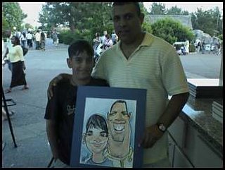
these were taken with my camera phone. Obviously it didn't have the high
resolution setting on. so they look like caca...
father and son
the guy was just kinda buggy looking.
character design, storyboard, caricature, illustration, sketches, doodles, cartoons, comics
Thursday, August 31, 2006
Sunday, April 23, 2006
behold! another Caricature sketch blog
Okay, first post of the sketch blog.
Here are some in park sketches I did last Tuesday. I tried to really exaggerate the whole day. A few of the early ones were done with a presketch, but most were just freehanded.
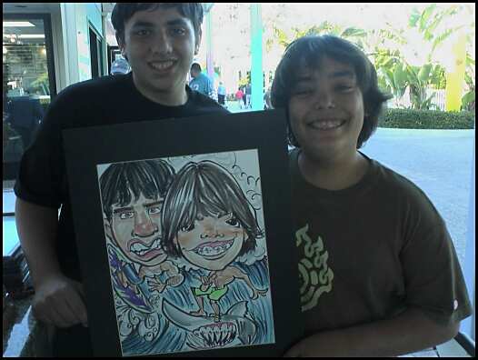
I find it a little hard sometimes to really exaggerate the faces when the bodies are going to be in there too, but sometimes the faces help themselves. These two guys didn't mind looking goofy as hell, so I went to town on them, and on the shark.
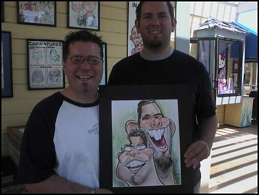
this was my favorite in terms of composition. The smaller guy had a rounder but eggplant shapped face, and his teethy smile and glazed eyes are a nice contracts to the scruffy other gent with round ears and teeth. The layout worked well, with some overlapping, but still getting the main features in there. for the tongue on the taller guy, I used the pink and shaded it with the Tuscan red. This creates some nice depth in the mouth.
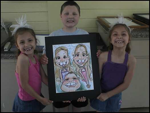
I like the girls' teeth in this one. They were twins, and were making some really funky faces when I was drawing them. I captured them with their big eye look, not the squinty eye face that they were making in the photo. The boy was less successful, but still morphed into a droopy triangle, which I liked. The parents were cool. I'm kinda shocked they bought it.
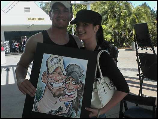
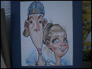
A nice couple sketch. I drew the guy a little too hillbilly for his own look, but his teeth and small eyes aided to that. The girl had a chin that was nice and pointy and a wavy boned nose. I liked that they both had hats... it worked.
i'm definitely going to try to push the exaggeration more. It worked well, and I only got rejected once.
Subscribe to:
Posts (Atom)